.png)

Power BI tricks I can't live without - Part 1
- Mara Pereira
- Dec 16, 2020
- 3 min read
Updated: Dec 1, 2022
That's right! There are a few things that I use a lot in Power BI, and no, I'm not talking about buttons, bookmarks and the selection pane, even though these 3 are definitely the ones I use the most.
I'm talking about those small, almost hidden options, those ones you barely notice when you're new to Power BI. Having this, I decided to share with you some of the tricks I'm using all the time during my report development.
Let's get started!
1. Change Slicer Orientation
Did you know you can change the appearance of a slicer by changing the orientation to Horizontal?
It’s as going to the formatting tab of the slicer properties and change the Orientation option to Horizontal:

2. Matrix: Show values in rows instead of columns
Another one I wish I knew sooner! Did you know you can have values shown in rows instead of columns?
Let’s check how this works: on your matrix visual, click on the Formatting Tab and under the Values section make the option Show on rows active:

3. Matrix: the pivot table dilemma
If you work with Power BI, you probably had to make your matrix look more like an “excel pivot table” at some point. The problem is, by default, your matrix will show you the table in a stepped layout.
You can change the way the rows are displayed by going to the Formatting Tab and under the Row Headers section you can turn off the Stepped Layout option:

4. Organise your columns/measures into folders:
Took me some time to figure out this one to be honest, can’t live without it ever since!
To add a column/metric to a specific folder go to the Model Tab of Power BI Desktop, select the column/metric you want, and on the Properties tab just write down the name of the folder:

Tip: You can add multiple columns/measures to the same folder at the same time! Just click on them while pressing CTRL.
5. Shadows
Wait, shadows? What exactly are we talking about??
Yes! You can add a shadow to your visuals, it looks awesome. Gives you that popup feeling, amazing trick to highlight certain visuals on your report:
6. Buttons: change colour on hover
I used this one in pretty much every report I’ve built. It gives you that app navigation feeling when hovering over your buttons:
Tip: You can also change the behavior of the font, the icon, the border...
7. The Top N filter
“Show me the sales for the top 3 customers”, is this kind of request familiar to you?
There is a simple way to show this, you can filter the Top values directly from your visual level filters!
How do you do that? Check below:

8. Enable search on slicer
Imagine you have a slicer that has 100+ customers. Do you want to scroll up and down endlessly looking for the customer you want to select? Of course not... That is why we have an almost hidden feature available: the search box!

9. Align Visuals
The trouble you have to go through to get your visuals perfectly aligned, oh only Power BI developers will understand. You can save time a lot of time if you use the aligning options available:

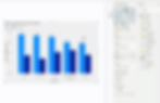
10. The average line
Want to know which countries are above and below the average sales? Fear not! You don’t need to build a measure for that, you can just add an Average Line through the Analytics Pane!

Tip: Depending on the visual you have multiple line options you can add. I particularly like the new release: Anomaly Detection.
Interested in learning more about Power BI Report Design? Then the Power BI Report Design Bootcamp is for you!

