.png)

Error bars tricks - Bar chart with rounded corners
- Mara Pereira

- May 15, 2023
- 3 min read
If you’ve been following my posts, you probably know by now that one of the things that really annoys me in Power BI is not being able to build bar charts with rounded corners, unless you use a custom visual.
However, recently I found out about a trick to make this happen without needing to use custom visuals (special shout out to Federico Pastor who shared this trick with me!).
And what is the trick? The trick is using error bars! So instead of having the chart on the left, we will end up with the chart on the right, which looks pretty cool don’t you think?

Let’s get started!
Note 1: for this exercise, I’m using the sample Financials dataset from Power BI. You can easily get this sample data by clicking on “”Try a sample dataset” when you open Power BI Desktop (check image below).

Note 2: for this exercise, I’m using the new On Object feature in Power BI Desktop. To enable this feature go to:
File > Options and Settings > Options > Preview Features > On object interaction


1) To start this exercise, I built a line chart using the country column as the X-Axis and the Sales column as the Y-Axis:

(Yes, a line chart to build a bar chart, weird I know! But wait for it...)
2) Click on the "Add or remove visual elements" option in your line chart (there will be two squares with two options on the top left corner, it's the one with the little painter brush!). Then click on the "More options" button so you can see the Format tab for the chart:

3) In the Format pane, if you scroll down, you will see the Error Bars section. In the Options, Enable the error bars by changing the toggle to On:

4) Now we need to define the Upper bound and Lower bound for the error bars.
The upper bound will be the value you used as the Y-Axis, in this case, the Sales amount.
The lower bound will be zero, as we know there won't be negative sales for this dataset we should be ok (this trick works better if your values always have a zero baseline).
For the Lower bound, I just created a measure like the one below:
Lower Bound = 0
5) Now we just add our two values to the correspondent fields in the Error Bars section of the Format Pane.
By the way, if the Format Pane disapears, you just have to click here:

Let's add the Upper Bound value to our Error Bars:

And now the Lower Bound value:

So now you should have something that looks like this:

It doesn't really look like a bar chart does it? We will change that in the next few steps!
6) It's time to format our bars so they look more like a bar chart instead of... yea... whatever it looked like before!
Still in the Error Bars section of the Format pane, we are now going to max the width of the bar (put it as 10):

Now here is the trick to make the bar corners look rounded!
Change the marker shape to a circle, make sure the border color is the same as the bar color, and then change the marker size so it matches the width of the bar (a bit of trial and error might be needed here):

Can you see the rounded corners already? It looks awesome!!
7) That line is not doing much in our chart now... To remove it, go to the Lines section of the Format Pane, and then set the stroke of the line to zero:

8) Now it's just a matter of formatting the chart a little, things changing the chart title, removing the Axis titles. To do this, you just have to double click in the part of the chart you want to edit (e.g. double click on the title of the chart) and you should be able to easily change and format it:

You can easily remove the Axis titles by double clicking on them, and disabling them on the Format Pane:

Do the same for the Y-Axis.
This is my chart with the formatting changes applied to it:

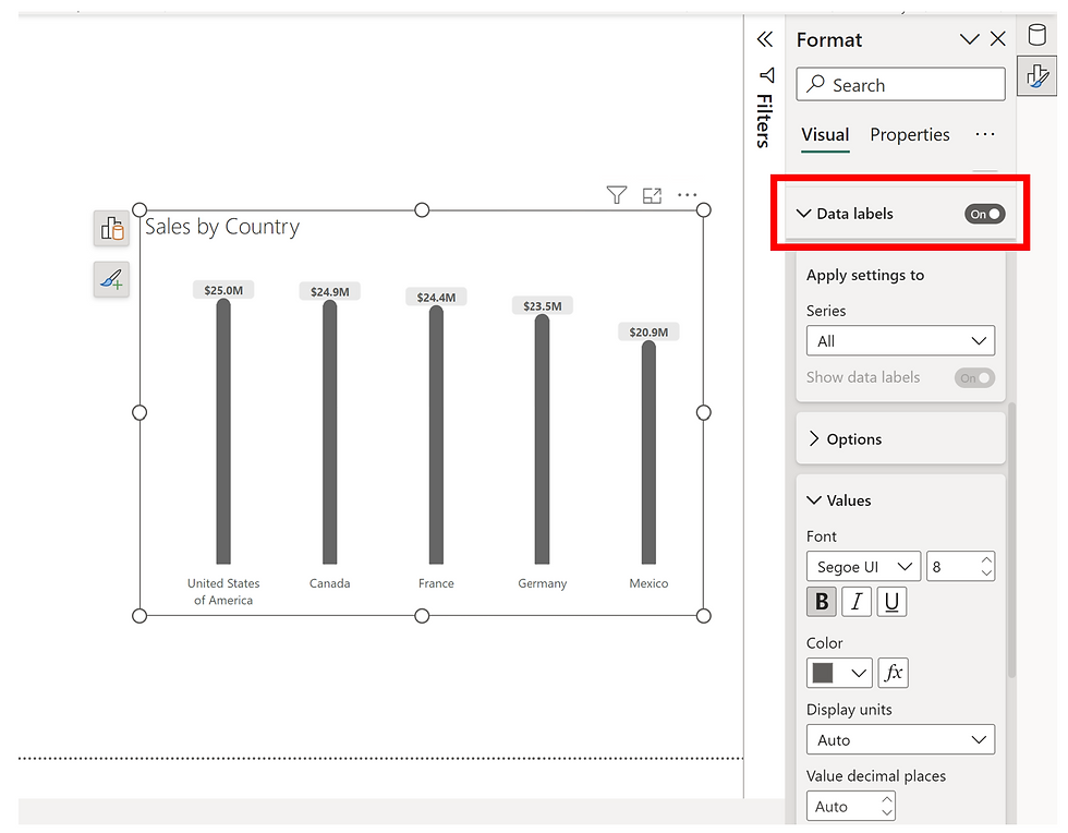
Now I'm just adding some data labels to make my new fancy bar chart more insightful:
And here it is, our line chart transformed into a bar chart using error bars!
Note: The tooltips will show the error bar values, if you want to remove these from your chart, go to the formatting options of the Error Bars and disable the Tooltip:

I hope you found this post useful :)


Great post — I like how you turned a Power BI limitation into a clever visual trick. The rounded-corner result feels clean and modern, and it’s a nice reminder that small design tweaks can make dashboards much easier to read. This kind of practical, creative approach is exactly why I keep coming back to posts like this, especially when I’m looking for Best health and social care topics ideas and want my charts to look polished, professional, and engaging too.
Can Powder Coating in Warwick, RI repair minor imperfections on previously coated surfaces effectively?
This post is incredibly well-written! I love how you’ve presented the information in such a clear and engaging way—it makes it easy for readers to understand and apply the ideas. The practical insights you’ve shared are truly valuable and show real expertise.
For anyone looking to secure funding for their projects, Grant Writing Services can be a tremendous help. Experienced grant writers know how to craft proposals that meet funders’ expectations, highlight key project strengths, and improve the likelihood of success. These services are especially useful for nonprofits, startups, and research initiatives, as they save time and reduce stress while ensuring the application stands out. By leveraging professional grant writing support, you can focus more on implementing your project goals while…
I had a small hole in my wall and wanted it repaired properly. Drywall repair and painting broomfield co looks like a company that can handle both repairs and painting efficiently.
Excellent points highlighted throughout the post. Removing debris promptly prevents potential hazards. Trusted junk removal and hauling services In Chariton County, MO support organized and efficient disposal.